Contempary Colour
Initial Ideas
For this assignment based on colour my first feeling of ideas is flowers: the idea of creating blurred images to create an abstract and alternate perspective for the viewer, would be an interesting idea to play and experiment with: Like the work of Bill Jacobson. Taking an ordinary subject that maybe is seen quite simplistic and purposely shooting it out of focus; the outcome is very creepy, and the colours are merged into one much like the photo below:

(Image: “New Years Day” #5002, 2003, by Bill Jacobson. Image courtesy of Julie Saul Gallery, New York, NY)
Here is an example by Ben Heys, he experiments with out of focus flowers, i am going to look into his work further later in my blog:

As i am particularly interested in botanical specimens and creating up close macro shots in there original environment outside, i may change and create a studio inside my house using an ordinary lamp and putting the forms on reflective white and black material, this will create a illuminating and vibrant image much like the photograph below by Ruth Hill. I want to shoot a film experimenting with different compositions and using my macro lens to create textured images, showing the layers usually hidden from the human view. Maybe even purposely creating images that show features of the form that the eye cant normally see.

The main photographer i am going to look into further depth about is: Edward Weston, Imogen Cunningham and Rinko Kawauchi.
Colour Wheel
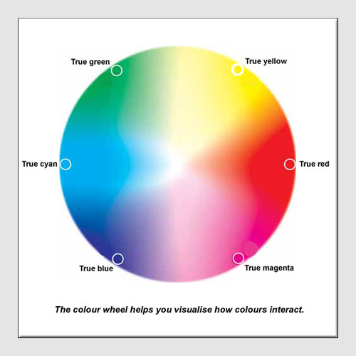
Wikipedia's definition of colour:
'Colour is the visual perceptual property corresponding in humans to the categories called red, green, blue and others. Color derives from the spectrum of light (distribution of light power versus wavelength) interacting in the eye with the spectral sensitivities of the light receptors. Color categories and physical specifications of color are also associated with objects, materials, light sources, etc., based on their physical properties such as light absorption, reflection, or emission spectra. By defining a color space, colors can be identified numerically by their coordinates.'
Primary colours are three key colours which cannot be made from any other colour;Red, Blue and Yellow.
Secondary Colours
A secondary is made when you mix it with an equal amount of primary colour;Purple, Orange and Green.
FOR EXAMPLE:
Red + Yellow = Orange
Red + Blue = Purple
Blue + Yellow = Green
Red + Blue = Purple
Blue + Yellow = Green
Intermediate Colours
When mixing a primary colour with a secondary colour, ratio of 2:1, you get Intermediate colours – Redy-Orange, Bluey-Green and so on.
When using colour photography, the main aspect you have to take into consideration is that the background colour will affect the foreground colour. This wheel helps to work out what colours make when mixed:and black is not a true colour.

FOCUS LOST, PERSPECTIVE GAINED
Mike Le’s

Lily of the Nile Impressionism
‘Sometimes one needs to look at life through a microscope, other times, through a telescope, and once in a while, via an out of focus camera view finder’ …
Mike Le explains his work: When these Lilies of the Nile (Agapanthus) are in focus, they are quite ordinary; however, when I threw them out of focus, they transformed into a frame full of movements and colours. Sometimes, a fuzzy concept is a beautiful thing.
He is a software engineer and an aspiring photographer who loves to photograph seascape during the twilight hours. He works with natural light and hopes to illustrate what he sees and feels through his photographs rather than to reproduce photocopies. He believes that he shouldn’t attempt to recreate images that countless photographers have captured so perfectly, Instead Le concentrates on photographing the local beaches close to his home, where he feels most comfortable.
Ben Heys
I found Heys work on 123rf; it is a social website for everyone to upload there own photographs. The abstract close ups of natural forms intrigued me as the shapes and textures that are create out of focus and nonrepresentational photos of what it actually is. The striking colours are outstanding, it will fit in nicely with my assignment named ‘Colour’.
Hey’s has inspired em to use a macro lense to create abstract shots of natural forms for example: Flowers,leaves,grass. I want to use forms that have the same striking colours such as reds,oranges to make the viewer unsure of the subject.

Abstract shot of out of focus part of flower - looks like flames

 Nature abstract shot of bottle brush flower with shallow depth of field
Green Leaf on a white background isolated
I particularly like the idea of isolating an object especially a natural form such as a flower. The idea of taking the form and creating a simplistic image; the isolation will make the highlights in the colours stand out, textures look 3D and the extraordinary shapes stand out as silhouettes.The only feature i would change in the image is the colour of the background, i want to create dark reflective shots by placing the form on a black surface:using velvet. An example of this:

Advertising poster for Ikea
They describe this canvas as ‘the slightly out of focus flowers on this poster adds a touch of softness to the vibrant fuchsia hues.’ http://smallhomebigstart.blogspot.com

I chose to look at different sorts of photography such as Advertising, searching in google Ikea appeared. I don't particularly like these images as the colours are too overpowering and give off a sense of fake intentions: i mean that the bright pinks and whites are just to sell for peoples decor tastes.

Advertising In Ikea: Wall decoration poster
Max Attenborough
These images are from Max Attenborough, guest pro photographer in PhotoPlus magazine from march 2010.
He specialises mainly in interior styling photographs and I came across several image which coincide with my idea of shooting flowers with a macro lens and a mainly plain backgrounds.
Attenborough trained as a fine art painter and prefers to use ambient light for the bulk of his work, only then introducing other light sources to create outstanding highlights.


I like the idea of mixing two opposites together, forever using dark, vintage colours against the dreamy, white textures of others: i want to create this technique myself by choosing a spikey or rustic/sharp looking form and present it next to a delicate beautiful form, this i will then print out next to each other on an a3 sheet of paper. To look closer at the idea of putting contrasting images together i am going to look at the work of Fleur Olby.


Attenborough is inspired by picking fresh bunches of flowers in season from the garden, and then positioning them against a similar coloured background to reinforce the dreamy, mystical forms.


Descriptive words that come to mind when observing this image:
- Colourful
- vibrant
- pastel
- layers
- filling the frame
- Overlapping
- Shocking
- Lipstick Pinks, pale pure whites
Fleur Olby
Fleur Olby is a Brightonian photographer, who completed her Foundation in Art and Design course at Bradford College in 1988. She then undertook and achieved a degree in graphic design and illustration at Brighton Polytechnic. Olby quotes:
“Towards the end of the course I had started to take photographs to use as reference but always hated the technical side of photography. My work at the end of the degree was a mixture of printmaking, mark making and the odd snap and not a cohesive whole with a strong direction. Luckily I had obtained a place on the postgraduate MA course in Graphic Design at St Martin's School of Art. This course was very unstructured with quite a strong slant towards the thesis. This is what made me find the backbone of my work and helped me gradually combine my visual work into something strong and commercial."
After graduating Fleur had a small black box of floral prints and was now calling herself a photographer. Fleur then started to photograph still life, within a tiny studio space in a business centre in South London in 1994. She picked up an advertising career there with: Bombay Saphire gin, sainsburys, London Under ground, tesco, boots and the body shop.
"In the summer of 1995 I was commissioned by the Observer's Life Magazine to go to a rose growers in Herefordshire to photograph roses for Monty Don's gardening column. This was the start of a seven year working relationship with the Observer and Monty Don which brought me an amazing amount of work and recognition. Alongside this I was commissioned by The Sunday Times magazine to photograph still life pictures of food for Sophie Grigson's food page.”

My inspiration came specifically form Olby's book published in 2005, Fleur: Plant Portraits by Fleur Olby. Olby's book includes a collection of 150 images of plants and flowers. In 2008, she gave up running her own studio to do more personal work for herself, here she is concentrating on photographing nature in its own environment.


The soft, delicate poppy is gradually opening contrasting to the sharp stem of the rose creating new shoots as it grows. Again, the colours are from the same palette, bright green with apricot and pink tones and a darker background. The poppy has a softly-lit grey background to highlight the intriguing shapes, whereas the rose stems are on a very clear, pure black, both compliment each other perfectly in an extraordinary way.

Parrot Queen of the Night
This photo in particular intrigued me as it reminded me of my own images, from my first shoot. The blurred outlines adds a shadow to the form, Olby s work inspired me to use the images from my first shoot and experiment with editing on photoshop; to highlight the dramatic dark purples further. The Contrast in this image is strong, and the tulip(s) fills half or more of the frame.
The work of Olby has influenced me greatly, and i hope one day to meet and hear there story; And also the other photographers presented on this blog.
Rinko Kawauchi
Kawauchi is a female Japanese photographer; she was born in Shiga Japan , in 1972 she Lives and works in Tokyo

Untitled, from the series Illuminance

Untitled, from the series Illuminance
Interview with Rinko Kawauchi:
How did you cultivate your photographic/artistic sensibility Rinko?
‘I prefer listening to the small voices in our world, those which whisper. I have a feeling I am always being saved by these whispers, my eyes naturally focus on small things. Even when I walk around Shibuya, I find myself running towards a little batch of flowers. I find comfort in them. I think this is a very normal sensitivity, on the contrary to what people may think, I think its sound. But of course the world we live in is not only made up of grass growing by the road, it is composed by lots and lots of other elemets and so I do also take pictures of many other things. Just taking flowers is not interesting. I experience the world with a feeling of equilibrium and I think it shows in my works.’http://pingmag.questions-to-rinko-kawauchi-about-photography/

untitled (from the series ‘aila’, 2004)
© rinko kawauchi

Untitled (from a array "Aila"
Kawauchi’s themes are based on family, human interaction with nature and the cycle of life: they are photographed in pastel colours; her work reveals exquisite delicacy, achieved through special composition and a careful attention to texture and the agriculture of a beautifully clear, clean, often whitish light.
Once Rinko Kawauchi said: ‘for a photographer, it's a necessity that you can shoot stuff magically. Accidents are necessary, but after I take a photograph, it is not all done. I continue to work on It.’ she suggests that the editing and presentation of the work is as important to the final image as composing and taking the photograph itself.
1st Film
After being inspired by these Photographers i went away and shot a film on reflective white paper that i bought from an art shop, and captured close up's of flowers using a flash on my Nikon D3000. Using my macro meant that i could achieve textured and abstract shots. The positive of this film are that the colours look beautiful, standing out from the high key background. From the florist i chose intriguing shapes that would make unique compositions for example:
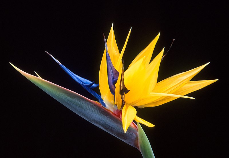
The bird of paradise flower known in Latin as Strelitzia, whereas in South Africa it is known as the Crane Flower:
and the Ornamental Cabbages:

Contact sheet from my 1st shoot:


This image has been cropped to remove some empty and unnecessary space and bring the attention more clearly to the unique shape of winding outlines of the petals. The horizontal lines created by the bright orange petals, leads the eye along the abstract line of blurred orange and black: i chose this flower in particular as the colours are extraordinary, fitting together and highlighting each other in every way. i think it is a beautiful, unique image- as the colours and shape show the viewer another concept of these simplistic flowers.


Possible series for my finals:


Jem Southam
‘The relationship between man and nature.’
Jem Southam was born in 1950, A British photographer, best known for series of Rocks, River mouths and Ponds: His coloured landscape photographs explore the changing physical environment of the south and south-west of Britain
In a series called “Rock falls”, Southam has photographed a section of the coastline of Normandy in northern France

Senneville-sur-Fecamp, April

Whale Chine, 1997. By Jem Southam. © The artist.
C Type Prints:


Stephen Shore
Country of Sutherland, Scotland
1998, printed 2000
c-print mounted on aluminum
36 x 45 inches
SS 51

Stephen Shore
1988-2000
c-print mounted on aluminum
36 x 45 inches
SS 50
Shore has began travelling the world, intruiged by the different cultures and appearances; he began photographing American and Canadian landscapes. In 1927 a road trip to Texas

Stephen Shore
January, 1973 p 204U
1972-2005
c-print
5 X 7 1/2 inches
SS 572

Stephen Shore
Mt. Shasta
2003
Artist book
8 3/4 11 1/4 inches
edition of 20
SS 104
I chose this photo in particular by Shore as the layering of images on top of each other intruiged me: This technique adds an abstract effect for the viewer and the neutral colours on the bottom half of the photo, remind of old historical images. Adding another layer to collage, creates a wide depth of field over the rural landscaped image: maybe he even used a wide angle lens.
William Eggleston
Eggleston is an American photographer; he is particularly famous for his use of colour in his photographs. He mostly photographs: the American south and his native land. In the south he captures qualities e.g. rust, decay, self-wear and even the rural ness in urban surroundings. Eggleston tries to show the world in a different perspective. The outstanding colours in this caught my eye, the electric oranges running diagonally across the image gives a sense of depth of field: and the random linear qualities created by the baby pink wild lupins adds a textured surface. Eggleston suggests that he is not afraid to put random colours into one image, i want to create a shoot similiar to this.

William
Eggleston_
untitled_field
1978
He is one of the popular photographers as his body of work Is captured mainly in colour. Eggleston was also one of the first photographers to exhibit in colour. He has especially inspired me to create photographs with outstanding natural beauty without editing, capture striking contrasts in colours with a flower in the studio. I want to take a form from the natural environment such as a leaf and photograph it on reflective black velvet, to create simplistic but beautiful shots.

Torch café

Eggleston William,
1939
Dried flowers
USA
Taryn Simon
Taryn Simon was born in New York in 1975, She is an american photographer. Her photographs and writing have been featured in several publications such as the New York Times Magazine. My favourite from her collections of work is: Contraband done in 2010.
Contraband is a collection of global desires and perceived threats the collection holds 1,075 photographs. Each image is of a different item that had been taken from passengers and mail enteries into the U.S border: She stayed here for a week to continuously photograph the items. These unseen subjects range from radioactive capsules at a nuclear waste storage facility to a black bear in hibernation.
Simon's work intruiges me as i like the idea of taking personal items and photographing them singularly: much like a snap shot.I especailly like the way Simon has exhibited her images on a big white wall, to further the idea of being detained. The pale and nautral colours and clean white backgrounds adds to the feeling of detainment and being trapped.I want to interpret this idea of specimens myself, taking natural forms and presentig them in a scientific way, and getting the viewer to see natural forms from a different perception.
This is an example of what i'd love to experiment my photographs like:( I am going to look closer at this botanical book of specimens)

Herbarium book with specimens and descriptions and classifications, 1912
Examples of Simon's work;

Contraband
Lever House
New York

Exhibitions
Natural History Museum
Following the idea of specimens i chose to take a trip to London to explore the natural history museum and Somerset House: The natural history museum had a collection of specimens and an exhibition named Images Of Nature.The small glass cabinets filled with The John Reeves Collection was fascinating, here was where he collected all plants and identified them.

Smooth textures, rounded shapes, seeing something in a different way/context.

Bird of Paradise, Steilitzia Reginae
Franz Bauer 1758-1840
1818

These specimens are kept as illustrations to show what can be lost when a specimen is prepared, or as it ages.

Here is a photograph that tells you about Reeves intentions of his work:


Tumeric, Curcuma Longa
John reeves Collection
Watercolour 1817-1824

Original botanical specimens - as seen in the Cocoon, Natural History Museum
Below is an example of the preserved forms:


This valuable Hans Sloane 17th-century cocoa specimen, is just one of the Museum's 3 million plant specimens. Before moving in, each specimen must spend a week in giant Maersk freezers to ensure they are all pest-free.
'In botany, a herbarium (plural: herbaria) – sometimes known by the Anglicized term herbar – is a collection of preserved plant specimens. These specimens may be whole plants or plant parts: these will usually be in a dried form, mounted on a sheet, but depending upon the material may also be kept in alcohol or other preservative. The same term is often used in mycology to describe an equivalent collection of preserved fungi, otherwise known as a fungarium.'-Wikipedia

If i had more time to experiment with different techniques and ideas this would be one of my shoots, i love the idea of pressing a natural form and then photographing it as if it a scientific form of proof. Pressing the specimen would make the veins more apparent, even placing them on a light box and photographing them would highlight the shapes.The Herbarium collection helps to document the historical record of change in vegetation over time using these specimens.

Herbarium collection:
Jee-Yeon Koo


Veolia Environment Wildlife Photographers Of The Year Exhibition
This exhibiton is very unqieu and brings in contestants from all over the world, the photos in my opinion were spectacular. Each image was difference, showing pure skill. Seeing the images on a bigger scale was extraordinary, i bought a few postcards so i remembered my favourites, here are the photos that caught my eye and linked to the colours, textures, compostions and subjects i am following up in thsi assignment:
 Sandra Bartocha -Harbinger of spring

 Marton Schaul-Pasque flower at sunset
 Out of the blue- Edwin Giesbers
 Grass Strokes- Georg Kantioler
Amazon Exhibition- Somerset House


Carol E Hamilton

Contact sheet

| Jee-Yeon Koo has been a fine arts painter for many years painting specimens from the herbarium forms, In 1998 she completed the Certificate of Botanical Art and Illustration at the New York Botanical Garden. Her botanical art has been exhibited widely over the world. |

A specimen of Bowl flower (Cypripedium japonicum) from the museum's herbarium collection:
from the website: http://www.mnh.si.edu
Even though these are watercolor paintings, the idea of recreating such shockingly distinctive colours intrigues me, Using one colour form the colour pallete but then along with this using the different shades within that colour: for example Brown. chocolate, dark, light, murky. This way choosing a flower or plant with these different contrasting colours, the outcome would be beautiful much like Koo's.
Artist’s Story: Jee-Yeon Koo
'I've been a fine artist and teacher in Korea for many years, specializing in flowers in the eastern style of painting, using traditional materials and techniques. As principal art director for the national project for illustrating rare and endangered Korean plants sponsored by the Korea National Arboretum, I have painted many rare Korean plants. I was interested in Cypripedium japonicumbecause it is the most important endangered plant in Korea. My technique consists of many layers of dry brush watercolors.'-http://asbalosingparadise.blogspot.com
Veolia Environment Wildlife Photographers Of The Year Exhibition
This exhibiton is very unqieu and brings in contestants from all over the world, the photos in my opinion were spectacular. Each image was difference, showing pure skill. Seeing the images on a bigger scale was extraordinary, i bought a few postcards so i remembered my favourites, here are the photos that caught my eye and linked to the colours, textures, compostions and subjects i am following up in thsi assignment:
Tongue orchid and hare's-tail


Amazon Exhibition- Somerset House

Carol E Hamilton
Carol E. Hamilton began her career as a botanical artist and illustrator in 1987. Her award-winning work is represented in many book and foundations through out the world. Hamilton's art work has been exhibited at several places in the USA.

Cydonia oblonga, Quince, Panels I through III, each panel 24x40”, watercolor, © Carol Hamilton 2007
Hamilton describes her work as focusing either on entire specimens or areas of the plants, she feels that she is not only assembling a collection but also learning about the plant's structure from her brain, and placing it into a drawing: to become acquainted with the species itself. She has started to work on larger pieces over the years, i want to print out on A3 to create a overwhelming appearance for the viewer. I love the idea of presenting my final prints in panels and using neutral, dull tones to add a historical touch.


2nd shoot:
For my second shoot i wanted to use the studio, this is so that i have more control over the lighting and composition. I am planning to use a Macro lens attached to the 5D canon Digital SLR, to create deep close up images, i want the flowers to look abstract: i want to create photographs that are completely different to a persons normal aknowledgement of a simplistic flower. Having changed my mind after writing this, i chose to set up another studio-setting in my room using:
- desk
- tungsten lamp
- white reflective paper
- black velvet
- Nikon 1000D Digital SLR
To create the photos seen below, i would change the composition and play around with macro lenses to create more indepth, closer images focusing on the linear qualities of the petals.

Seeing these images on a big scale, produces a dramatic effect using colour, i want to create this by printing my images on A3 photographic paper.


I chose to present these images alongside each other as it sugggested the strongest visual sense of 'colour',i wanted each photograph to compliment the other. The pair of images are contrasting: Spikey & Smooth, Layered & simplistic.


The two images below i feel that individually they are too in your face, overpowering when you observe it. I think because of this the tones clash making the image stand with no visual appearnace:


Further Contextual Material:
National Geographic Collections
Over time i started to collect images that caught my eye, from The National Geographic Magazine. This panel of macro flowers are beautiful, the dreamy effect of the colours adds a characteristic effect. Each image compliment eachother as the backgrounds all fade into an extraordinary blur of colour, making the colour of the actual flower stand out.

This series of flowers is one of my particular favourites as the neutral tones running through all the images and make them work with each-other. Each outline of the petals blur into the background, i like the way the photographer has made that much effort to produce all the same coloured backgrounds: This makes the flowers diverse and each unique.


This series collected from the Naitional Geographic Magazine, was on specimens from the rainforest in the Amazon, using a macro to show closer detail and the patterns hidden beyond the eye can see itself.

'Spikes at the center of the Rafflesia Kerrii flower may help disperse its odor, the stench of rotten meat- throughout its jungle habitat. Attracting the carrion flies that pollinate the platter size bloom.'


'Many of the world's 675 Carnivorous species set passive traps. A bun size butter wort bristles with gluey hairs that ensure insects until digestive juices do they work.'
Robert Mapplethorpe
I have decided to look at Robert Mapplethorpe's skilled flower portraits as they are very well known, he lived and died in November 4, 1946 to March 9, 1989. They are very well known because his works have beautiful colours, contrasts, composition and lighting. Mapplethorpe especially likes to photograph Orchids and calla lilies. Here is a short video i found when exploring youtube, it shows all Mapplethorpes collection of flowers:

So much detail is captured in Mapplethorpe's photographs and I want this amount of detail in my own flower portraits. Also Mapplethorpe, Cunningham and Van Dongen have photographed some of their subjects in a studio so i have found it hard for me to create images that have the same amount of colour and detail as there's.

Orchid

Anemone


Edward Weston
Weston was born in March 24, 1886 and later died in January1,1958;he wasa 20th century American photographer. He is one of the most famous photographers being stated as "one of the most innovative and influential American photographers…" and "one of the masters of 20th century photography." Weston is famous for his wide range of subjects including landscapes,stilllifes,nudesandportraits. Interestingly over 2 years he produced nearly 1,400 negatives using his 8 × 10 view camera. Some of his most famous photographs were taken of the trees and rocks at Point Lobos, California, near where he lived for many years; He abandoned many styles and then went on to be one of the champions of highly detailed images, as seen below.

Artichoke, Halved 1930
This is a photographs of Edward Weston’s vegetable studies. If I didn't know it was an artichoke, I would think it is an inside view of flowers. He took the photograph with very close-up distance, this clearly represents the layers and textures hidden within the vegetable.


Not only has he used vegetables in his still life work he has used flowers, which are common for all the still life artists i have been looking at. The image is black and white but seeing this type of flower normally in an naturally bright and colourful composition, he has managed to keep the elegance of the flower itself: A lily. I love how the has shot two photographs of the flower but put them next to eachother to show the contrast and difference you may not realise before; i have tried to create this idea of seeing a flower out of its original view and into another perspective. Also i have focused in on the stamen just like Weston has, to show the smaller details.

This is a shell but in an unusual perspective, it confuses you when looking at it first, I lvoe the way he has created an unique photography out of this almost simplistic shell. The shapes are delicate with smooth flowing linear qualities, most likely lit from the front of the shell and with one light.

Imogen Cunningham
Cunningham was born in April 12, 1883 and sadly died in June 24 1976. She was an American photographer known mainly for her botanical, industry and portraits of people in the nude.

Magnolia Blossom, 1925
Estate Stamped Silver Gelatin Print (9 7/8 x 12 ¾ inch print mounted on 16 x 20 inch matt)
Imogen made this image of the Magnolia Blossom in 1925 for her own pleasure.Magnolia Blossom is considered by many to be Imogen's most renowned photograph.
Estate Stamped Silver Gelatin Print

Tuberose, 1920s
Estate Stamped Platinum / Palladium Print
This print of Tuberose is part of the collection of flora images that Imogen shot in the 1920's. It bridges the visual form of Two Callas with the softness of the Magnolia Blossom.

Rubber Plant
In 1930, Edward Weston wrote:
"With unmistakable joy in her work, with the unclouded eyes of a real photographer, she never resorts to technical stunts. Imogen Cunningham is a photographer! A rarely fine one!"I love the shadows of the leaf against the black background, i have tried to recreate this within my work as you can see below, it will never be as effective but the contrast in colours has worked beautifully:

Ron Van Dongen
Polaroid Positives


I am going to try and create the same outcomes as Dongen but in a different way; i am going to scan in a piece of crumpled brown paper and layer it over one of my own photographs of a botanical plant, washing out the colour will tone that brown old effect for the image.
Colour Flora
Dongen was Born in Venezuela in 1961, and raised The Netherlands. He began to study photography at an art college and from here he went on to produce these outstanding but simplistic shots of flowers. He describes his floral collection as:
'unearth floral secrets and symbols of our alternately nurturing and perilous relationship with nature.'


This image in particular is beautiful, i like how he has focused on the small winding stalks curling around the main shape of the flower. This carries on my idea of focusing on the smaller details of the flower to show the viewer a completely different perspective.

Christopher Beane
Beane became obsessed at an early age of photographing botanical forms, he has written many books presenting his collections of 150 images. He transforms pictures into unique and dramatic work of art. He was called: "the love child of Robert Mapplethorpe and Georgia O'Keeffe." He showed the public how he could present unusual floral shapes and textures, which aren't usually seen.
In the late 1990s, Beane left the black & white world of photography behind and went head-first into colour. In the words of Anthony Janson, who narrates the book: "Fortunately, in 1997 Beane began to experiment with color photography."


Beane is mainly interested in the use of a macro, Beane is always exploring new techniques and ways of deconstructing flowers to see a new appearance. The above photos were taken before the ones below, the difference is colour: placing the flower on an almost manic, crazy background to reinforce the striking colour of the purples in the foreground which is the water lily.

| Cibachrome print |

George O'Keffe
Painter

Red Canna, 1923

Light Iris, 1924
Light Iris is an example of O'Keeffe's painting, Comparing this to the Red Canna, O'Keeffe uses cool tones to suggest a different sense from all her other paintings; The style of her work is abstract and makes an impression on the viewer. The close up view of the flower lets you see the flower in a completely different dimension, in photography this would be created by using a macro lense. This painting is my personal favourite as it contains a very fluid and smoothly perfect shape; i feel if i had more time to adjust and work on experimenting my work further, to do so next time i would create sandwich prints with fabric scanned in through the scanner. this would create a traditional, old texture to the overall image.
O’Keefe’s work is mainly in charcoal, watercolor, oil, and sculptures. She was an active artist that lived and died in 1915 to 1984. Abstractions of the 1910s, to her innovative and famous large-scale paintings of the 1920s, which include flowers and other natural forms, as well as the New York City Scapes. She is most famous for her flower paintings as viewers are intrigued by the interesting perspectives; for example placing the original flower next to the painting, this shows the contrast in views, the eye cannot see as detailed until shot through a macro or painted by sections.

Finals

The colours have come across very bright: this is how i wanted it the image to look, i found the details came out clearer this way. I like both images but i don't think they create a strong visual image presented alongside each other, moving on from this i am going to create other pairs of photographs to see if the outcome is stronger.


Experimenting with different layouts

As i didn't like my layout early in the blog, i chose to learn from this and carry on experimenting. The two images above i feel suit each-other as one is very abstract whereas the other one gives a clear form. i am going to use this as my final as i think it portrays my idea the strongest: focusing on smaller features of the form, showing a new perspective that the viewer doesn't normally see from a flower.

Evaluation
Overall i am very pleased with my outcomes as they are hwo i wanted them to come out, at the beginnnaing of my prject writing my 500words i began with simplistic ideas: and now at the end i feel i have been inspired, influenced and read into many photographers to help me push my assignment further.
The main photographer that influenced my work is Fleur Olby: She uses mostly pastel colours in her work to create beautiful shots. The main thing i learnt from Olby was to fill the frame, these simple forms were in there element when placed in the foreground against a plain- neutral colour: this makes the intricate texture of the flower stand out clearer. I took this into account and placed the forms on reflective white and black material.

If i could go back and do more to project i would do quite a few things: starting by experimenting more with the forms. Placing them in ice to create a bubbly, old and similar to a botanical specimen, like i saw in The Natural History Museum.
I would also of loved to experiment with the studio setting, creating shots under powerful lights. As i couldn't fit into the studio, i chose to set up from home. It worked just as well but i think the outcome would have resulted more like the picture in my head if i had created them in the studio.
The final prints i have chosen i feel looked better on the screen, than when i eventually printed them out on the inkjet printer. This was because the photographs came out with faint lines across them, also i think i should have toned down the colours with the brightness levels and curves to create a subtler appearance.
Print Process
The first step for the printing process is open your image in photoshop, click image, image size it then comes up with a box showing you all the information you need to know about sizing and pixels. Change the resolution to 240. Depending on what size printing paper you are printing: you need to be over a certain amount of MB, the pixel dimension at the top of the box tells you this information; change the width to alter the P.D according to below:
- A4=25MB 29.7cm x 21.0cm
- A3=50MB 42.0cm x 29.7cm
- A2=100MB 59.40cm x 42.0cm
- A1=200MB 81.10cm x 59.4cm
When this is correct go to file and print,then make sure the right printer is selected from the drop down. Make sure the drop down under colour handling is selected on photoshop manages colours, this will make sure the right colours are printing out from photoshop. Down to printer profile scroll and select the type of paper you are using.
Next open printer settings make sure the right printer is selected, then select the paper size you are using. Click on layout and open print settings, another box will come up check that you are on the right media type 'photo semi-gloss paper' and check the print quality is on 'superfine- 1440dpi'. then press save when all of the above is done.
It will take you back to the main pop up print box: from here press print or save so you can go back to it and set up the paper in the printer.
If so align the paper against the measurement on the side so that the paper goes in straight and doesn't print wonky.
If so align the paper against the measurement on the side so that the paper goes in straight and doesn't print wonky.