JPEG stands for Joint Photographic Expert Group. It is the most popular and widely used format for viewing and sharing files. JPEG is where it compresses the images: This means that they are literally getting rid of some of the information forever, this is to reduce the size of image but in fact it makes the image have bad quality.
The biggest advantages of JPEG files is being convenient, they can be uploaded onto any website or presented on the internet as they only share a small amount of size.
TIFF TIFF stands for Tagged Image File Format. It is a type of format that does not get rid of any information like JPEG, but it lets you save at the highest measurement of image quality.
TIFF is mainly used for commercial printing usages as it compatible with all programs, it is not used that much anymore it is only used by printing companies.. The files can be very large using TIFF compared to the small size of JPEG files.
RAW
A raw file is like a negative, you can develop it according to each of your individual needs and the features you want specifically in the photograph. If you want to edit onto the photograph in photoshop or another program the best way you do this is using a RAW file, this allows you to edit over and over again.
I personally use this format when photographing on my digital SLR, shooting on RAW means that you get both JPEG and the original RAW file to work with.
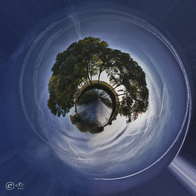
Initial Ideas For this project I had the idea of photographing like the video below, it gave me inspiration as i wanted to create unusual angles and surreal shapes. Finding this helped me as creating 'little planets' as they call it uses all these techniques and creates them into one image.
I am particularly inspired by the work of .....as he takes panoramic images in the countryside, but not only pure natural beauty within the frame you are drawn to trying to spot the unusual and industrial figures hidden e.g Electrical Wires. I am going to take on this idea and photograph at old historical, architectural ruins/bildings. But to ruin this almost perfect landscape, I will purposely focus on the new inventions that are ruining our environments.
the video below is interesting as it presents to you images from other photographers, and the process of which you take to create these 'Little Planets'.
Examples Of Photographers Work:
I like the idea of placing a figure in the image to add to the mysterious and un-usual environment I want to create. And contrasting the beautiful, natural environment to the people that are beginning to destroy it.
This photo in particularly has inspired me to have an eye for intricate and different shapes, that would create a spiral of interesting features. e.g photographing a long bridge with tunnels and arches beneath would create an intriguing result because of the continuous curves bending and winding.
Photographer David Jackson uses a technique called stereographic projection to turn landscapes and familiar landmarks into mini planets. Stereographic projection is a form of digital processing that shows a 360-degree spherical panorama as a flat image.
(Charing Cross Underground with Nelson's Column, London)
"The planet is the result of projecting the panorama. Whilst the computer does a lot of work to stitch the images and make this happen, it does not make any significant changes to the view. The finished mini-planet is a real representation of everything you would see in that location if you were standing in the middle of the image.
(Eastbourne Pier, East Sussex)
Alexandre Duret-Lutz A French photographer, specializes in creating what he calls "Wee Planets"- this idea is unique, I have never come across something so different in photography it turns an almost boring and plain image into an outstanding, surreal creation. From watching the you-tube video on how to do this technique and researching photographers, I began experimenting with my own images: Specifically looking at the main natural aspects of the world: Sea, Rock, Vegetation.
I particularly like the way Lutz has presented the photos in a grid form: this connotes the different sections and appearance of our world. Shooting different areas and environments but then placing them together to suggest one.
First Shoot
The Process Of 360'Panoramic
To start the process you need to begin by opening the photo: File, Open.
Once opened if the photo you have chosen has a lot of sky like the one I have chosen crop some of it out to create an even spiral around the centre of the image. Next I went to image, Image size, this was to make the image in a square shape. Change the width and height both to exactly 3000, click ok.
After re-sizing I went to Images, image rotation and rotate the photo 180 degrees.
To create the actual circular effect: I went to Filter, Distort, Polar Co-ordinates.
A small box appears, I made sure the rectangular to polar was selected and click ok: From this the 360* panoramic effect is created.
The outcome:
As the edges are not properly connected, I used the clone tool. This helped to remove and blend together the line in the photograph. By using the alt button to select the colour you want and then clicking on the part you want to change with this colour.
The final Image is revealed with a continuous spiral of colours from the sea-scape:
Final Prints Rock,Forest,Sea
The three images above are my favourites as they portray in the best way my initial idea: To create surreal and unique images from just plain shots.
Studio Portraiture Initial Ideas For this project I brainstormed some idea but felt I should pick two that appeal to me the most. One of which is to create experimental photographs : Ripping the photographs into strips and re-arranging new layouts, experiment with photo montage and sandwich-printing. As this project is specifically based on studio portraiture I had the idea to shoot with a very straight view of the model: much like the younger portraits of people taken when they were at primary and secondary school. I want to scan these older photos in to Photoshop and layer them over the newer portraits I have taken: I want to convey a change in age and show the growth in people and how one can change either so dramatically or not at all.
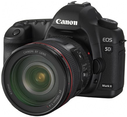
I have created a plan on lighting diagrams to help me set-up in the studio. Lighting the model from the front with a beauty dish to illuminate the sitters facial features: Two reflective umbrellas at the back to light up the high key background and finally I am using the 5D Canon SLR camera as I feel the 5x4 camera will not create the quality I want in my images.
Below I have created another plan of which I changed the position of the equipment to try different lighting techniques. Incorporating two reflective umbrellas on the back-drop again and a soft box diagonal to the model this diffuses the light, which in turns softens the shadows and even eliminates in some cases.
Sketches of studio ideas and What I plan my final prints to look like:
Equipment
5x4 Large Format Camera
What is a 5 X 4 Large Format Camera? Large image size: 4x5 inches/10x12cm Flexible bellows connecting the front and back. Ground glass viewing Interchangeable lenses
What are the main benefits of the large format camera?
Larger image size: Results are sharper, have a better tonality, and are grain-free.
Camera movements: You have more control on the final angle of the subjects and the plain of focus.
Individual sheets of film: You can use as many types of film as you like easily and their are indentations on the top right of the film sheet to help you know that side goes in first.
What are the disadvantages of the 5 x 4? Everything is manual.
Equipment and film: the equipment is bulky, heavy and relatively expensive.
Everything takes a long time: loading/unloading your holders moving around your heavy backpack composing in low light with slow/wide-angle lenses
Re-thinking and planning
etc..
How can you recognise exposed from unexposed film?
Exposed: By black side showing
Unexposed: White side showing
How is the film inserted?
Placed into the sprung back slot
What type of shutter does a 5X4 have?
Leaf Shutter
Movements: Three types of movements are:
Swing; Front gives a vertical band of focus/Back gives converging lines and diverging horizontals.
Tilt; For smaller subjects, Front gives a horizontal band of focus, Back gives a change in shape.
Slide; You would use this when photographing buildings.
Sourced from google images
Canon 5D After comparing the two cameras I have come to a conclusion that the 5D SLR camera will be the most suited for my shoot. The reason for this is because the 5 x 4 does not create the sharpest outlines and I feel I want the shoot to be quick and easy and as I'm not very good with all the manual, fiddly settings I have chosen the 5D: The portraits I have in mind have a very sharp focus, coning in on the fine details on the face. And highlighting the sitters features.
Example of a flower taken with a 5D Original:ISO 1250
sourced google images
Medium Format
Historical Images
Experimental Portraiture
In the middle of the 1800s, Hippolyte Bayard was one of the earliest photographers to create a sandwich print, 'Where two separate images are juxtaposed in a single photographic print.'
Self Portrait as a Drowned Man, 1840, Hippolyte Bayard, Combination Print.
Many people were amused by this new technique, For example Cubists (anearly 20th-century style and movement in art, esp. painting, in which perspectivewith a single viewpoint was abandoned and use wasmade of simplegeometricshapes, interlockingplanes, and, later,collage.-Dictionary) like Pablo Picasso. They began adding photographs that they had found for ex. in a magazine and print materials such as tape. What came form this was the word 'collages' known in French for 'coller' translated 'to paste'.
El Lissitzky's is an example of this type of work, He began creating self portrait's which combined his own head with parts of tools and machinery: This could suggest that he had a very mechanical way of thinking, an attentive man. It also could suggest that he is into new discoveries, new technology but through planning and drawing: The drawing utensil signifies an artistic character with academic skills to make new discoveries. The hand that is sandwiched over the top of his face looks the same as you see God holding his hand out to help.
The Constructor, 1925, El Lissitzky, Self Portrait Photomontage.
Lissitzky's and Bayard's photographs are created with different methods. Bayards print was made during the printing process using negatives overlapping each other in the enlarger, whereas Lissitzky's photomontage combines already printed materials stuck together.
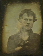
Worlds First Portrait
In 1839 Robert Cornelius a Dutch chemist, immigrated to Philadelphia here he took the first portrait of himself and used the first photographic process named 'daguerreotype'. Cornelius made history this day as he was seen as making the world’s first human, male portrait.
World’s First Human Portrait: Robert Cornelius 1839
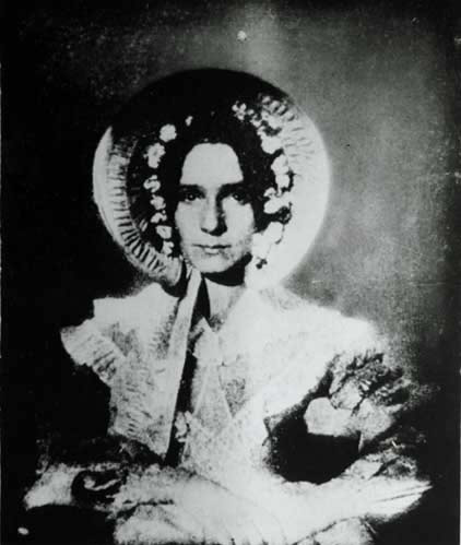
Below is a the worlds first portrait of a woman: Dorothy Catherine Draper. Draper was the sister of a professor named John Draper she modelled for the first portrait of a woman in the United States in 1839. From here she became a very famous woman as she was the first to be captured with her eyes open in a portrait.
John Heartfield (Germany b.1891–d.1968)
Millions Stand Behind Me
The photograph above is by Heartfield he was particularaly interested in world war 2.
In this montage above Heartfield specifically links Hitler's success to his wealth within the industrialists. The main point of focus is the man standing behind him, he is seen as an high up figure towering over Hitler: A buisness man handing Millions of pounds over to him, at the bottom of the image it quotes 'Millions Stand Behind Me' this suggests that Hitler is comparing the money to the millions of people that follow him, implying a very selfish manor.
Also he is standing backwards to the business man with his right hand up in the air, forming his traditional hitler salute. This maybe implying that money creates power for him suggesting that the salute is in fact a plea for cash.
The photo below 'Superman' suggests the same aura for the viewer as he has his big mouth open, implying that he is shouting at his country to listen. Heartfield has also photomontaged the nazi symbol instead of a heart and spine as a long fall of coins: to show that he is devoted to his dictatorship but is a very wealthy and greedy figure.
Adolf The SuperMan
Oscar Rejlander (b.Sweden 1813 – d.Clapham,
London 18 January 1875)
In 1857 Rejlander created his best known piece of work 'The two ways of life'. This was a montaged print made from thirty two images, this took Rejlander six weeks to complete.
The photograph symbolises two youth boys being offered guidance from a patriarch. Each boy looks in a different way, away from the patriach: One youth is looking to the right in the direction of angelic pleasures and the other contrasting to the sinful pleasures on the left side of the room.
The side of what seems full of pleasures was deemed against in those times, the nudity was indecent and those familiar with rejlander s more commercial work suspected that he had used prostitutes as they would have been cheap to model for him. This was all changed when The Queen at the time: Victoria, out of the
blue ordered a copy of the image to give to Prince Albert.
Penitence, photogravure, 1857
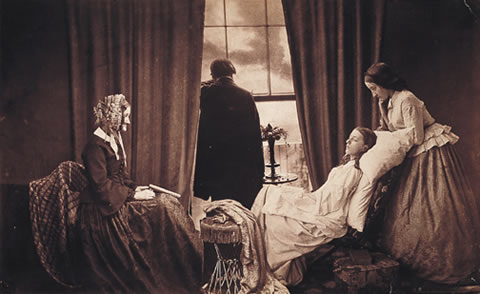
This creation paid of well for Rejlander in the end, it gave him social acceptance into London. After this he became a confident experimenter specifically with: double exposure, photomontage, manipulation and retouching images. This gave him a broad knowledge of this subject and an expert in photographic techniques: After this craze of this image he began photographing homeless children in London's streets producing popular 'social-protest' images like 'Two lives' such as "Poor Joe". Rejlander died in 1875 from a serious illness.
Rejlander's "Poor Joe"
First Photo-montage
In 1858, Henry Peach Robinson made the world’s first photomontage by combining multiple negatives to form a single image. Robinson's first and most famous photo called "Fading Away" which was created by placing five negatives over the top of each other. It depicts a composition of girl dying of consumption or tuberculosis. Some people objected to the photo montage by Robinson as it was seen as too morbid.
Contextual References
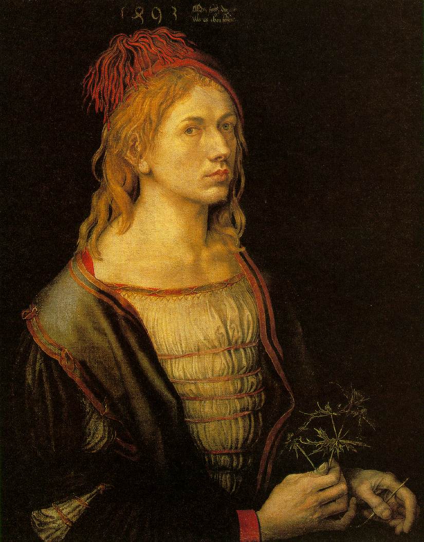
Albrecht Drurer Self portrait 1493
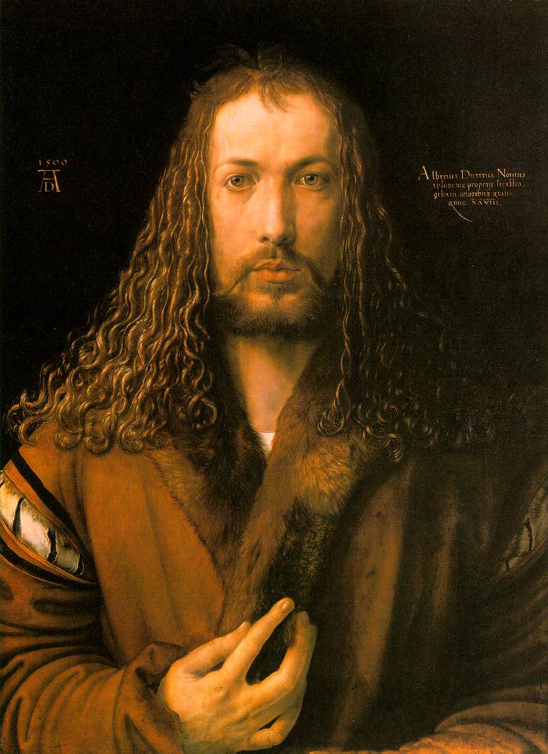
Self-Portrait at 28 (Self-Portrait in Fur coat)
This photograph was taken 500 years ago, he came over from new York to Paris in the 1920’s. Albrecht Drurer Self Portrait 1500: Artists don’t paint themselves they were paid by people to paint others. This is one of his most famous paintings, as it looks very similar to Jesus. Drurer signed his work, which was weird as it is like signing it as his possession- your parents name and profession is what you are recognized by.
Elizabeth the 1st Marcus Gheerearts the Younger c1592
The painter himself was in the presence of Elizabeth many years ago: the proportion of her body is very exaggerated, skinny waist, bulging arms, tiny head and hands. She looks as pale white as her dress: looks similar to a Barbie Doll the stereotypes of body shapes now a days. She is standing on a map of the south coast of England, this is because Portsmouth is the most famous navel base: as she is looking south it suggests watching over at the Spanish Amador coming to invade England. The daughter of Henry The 8TH, the Spanish Amador was because of Henry. He divorced a catholic woman of which they felt you weren’t aloud to do, he then went on to marry 6 women two of those were beheaded: Katherine, Anne.
Elizabeth made England a protestant country (Protestantism is one of the major groupings within Christianity. It is a movement that began in Germany in the early 16th century as a reaction against medieval Roman Catholic doctrines and practices, especially in regards to salvation, justification, and ecclesiology)
Elizabeth 1 Armada portrait George Gower c1588
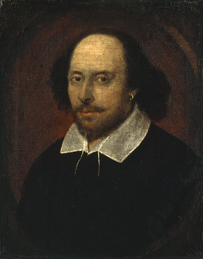
William Shakespeare John Taylor c1610 (from life) (First NPG)
This is the portrait that is used time and time again to portray himself as our playwright.
Gold earring- Suggests something about his character, in the 17th century it was suggested as a sexual preference in a certain ear,and in those times earrings were not common.
Diego Velazquez Pope Innocent X 1650
Royal man, high up and very important.
He looks fairly scary and can do whatever he likes as he belongs to the church:
He is an intellect as he is holding a script: very uncommon in those times.
Large ring on his finger, signifies wealth.
The two images below intrigued me as the way each girl is dressed in old fashioned attire, This has influenced me as both of the lighting is very soft and intricate much like the work of John Kelly both use natural lighting to create a glow in the models faces.
Diego Valezquez 1636
The young girls look very awkward this reminded me purely of those awkward situation were you had to be pushed into getting your school photograph taken: I want to re-create this atmosphere for the viewer through use of facial expression.
Yasumassa Morimura 1989
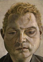
Lucien Freud Freud was born in 1922 and died recently in 2011 at the age of 88 from a brief illness: He was known for his famous drawings and paintings and for being the nephew of sigmund freud. He is such a famous figure in art as he looks specifically at the rich artistic and intellectual work he creates.
Freud was fled by his father to London as he rise of Hitler was approaching, this is where he began creating his first sculpture which earner him acceptance into the Central School of Arts and Crafts in London. Freud was influenced specifically by painters such as Francis Bacon and Edward Hopper which were also influenced by him too. From then on he began painting figures and went on to be one of the most influential figurative painters.
The models that he choses are mainly his friends and family they each have to remain in place for several hours in a row, The strong details of these models shows as we recognise the relatives, he describes his paintings as 'His new style revealing a different way of looking and seeing the human being: his eyes are turned to the emotions of the subject.'
Chuck Close
Chuck Close Self portrait 1967-2005
Chuck became ill and couldn’t use his hands so used his mouth for all of his paintings, they are created using Polaroid’s, which are split into small squares which then he draws from. He only paints people he knows not celebrities or famous people, much like Freud. As well as looking at Freud I felt I would look into the work of Chuck too as he uses artistic strokes too, the brush strokes Freud uses with oil paint are much like the collages chuck uses with small abstract paintings of polaroids.
He is one of the most influential figurative painters of our time as he focuses on portraiture. Close’s self-portraits all have media in which he works from: painting, drawing, photography, collage and printmaking.
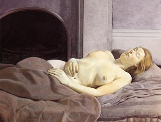
Below are more paintings by Freud:
Reflection, Lucian Freud, 1985
Long drawn out face: tired
Grumpy
Looking slightly away from freud (NOT DIRECT)
intricate creases, wrinkles, hairs
The shoulders are very muscular and bulky represents a practical and physical man
slight grimace on his face: looks confused or could be slightly awkward as he is painting himself from a reflection
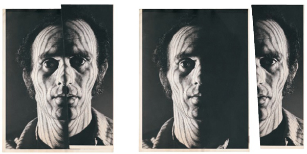
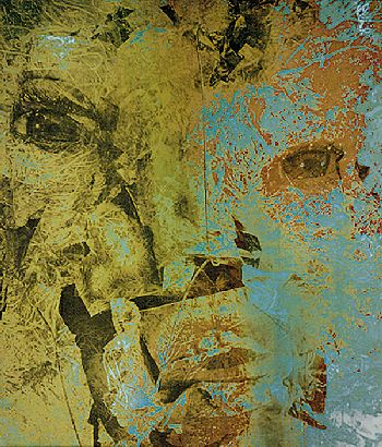
Michael Druks
I love this creation in particular as the presentation is very cleverly put together. Presenting a surreal side of the face against the original image has inspired me to present my to images besides each other: on the left the older, young portrait and on the right the newer portrait of the models. This print is very experimental, focusing on the unique way he has created his own self portrait.
This piece connotates colour, pattern, effect, edited: This denotates two sides to his personality, on one side a very calm and approachable personality whereas the other is comparative suggesting a bold, crazy side to him. He describes this as being inspired by 'exploring and mapping the constituents of his personality.' Druks is inspired specifically by creating a personality maps: showing the connections between places, people, secrets, feelings and dreams which are hidden behind the flesh of the model.
"Druksland" Self Portrait
Michael Druks was 33 years old when he started to create his self portrait project. Using a slide Druks projected stripes onto his face and then photographed each side of his face separately. He copied the photographed image onto acetate and marked the one side in different bold colours. His idea was to match the lines much like contours on a map to the shape of his face.
Michael Druks - Druksland - Physical and Social - 8 November 1973
Looking at Druks in more detail has help me to think about the idea more, behind my photos. I like the idea Druks has focuses on the human mentally and the truths that are hidden beneath us.
Sriluka's Photostream
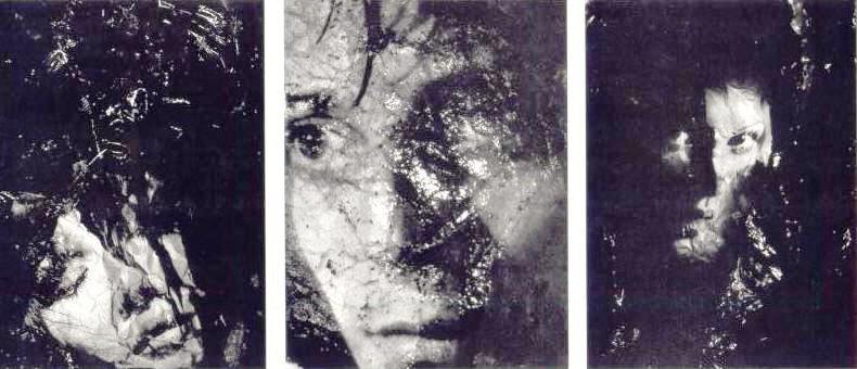
These portraits where created when developing the print in the darkroom: Taking one straight shot of the models and another sideways on. After developing these in the chemicals, the negatives were then overlapped on top of each other in the enlarger, and exposed through the photos are produced. These are really interesting images as they're experimental but simplistic: this has pushed my idea forward as the effect of black and white in these images is very contrasting, I want to create the same tones for my one b/w image.
Layered effect with materials such as tracing paper: This could signify a split personality and dark side to her moods.
The gentle flowers on the bottom of the image suggests a contrast in subjects.
One dark eye contrasting to the other pure humane eye.
Greta & Lilies, apologies to Steichen
These are collages made from negative sandwich prints, Edwards has taken this photo from a website it is not her own: a picture of Greta Garbo stolen from Edward Steichen.
Greta in Tuscany androgynous split
Contrasting her mood and appearance to the thunder and black clouds
As the weather is seen as bad when it is stormy: presenting her in between them suggests a godly spirit
She has control over the world/weather
Spiritual and god like figure
Edith Lechtape
Edith Lechtape was born in 1921 in Germany. Lechtape started out her career with Antoine Weber, who had been involved in Photography for about twenty years by then. This encouraged Edith to explore photography into extreme depth, she began using it as an expression, creating experimental pieces incorporated with photographs, painting, and drawings.
Antoine Weber:
Untitled
Self Portrait
Lechtape is mainly inspired by layering as it is her main focus, I personally love her work as they all have an old fashioned texture drawing your eyes in further to discover new features in the photographs. Although they are not really portraits of people i felt the experimental approach is interesting, They could be seen as portraits as you don't necessarily tell a portrait from a straight shot of the model: This is a portrait but with loss of identity.
"Gossenportraits" von Edith Lechtape
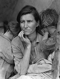
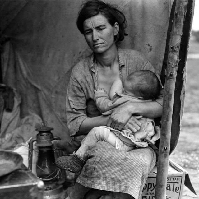
Dorothea Lange(b.1895 – d.1965)
Migrant Mother, taken by Dorothea Lange in 1936-Florence Thompson
Denotation & Connotation:
·Two young boys/children, 1 baby in her arms/lap
·Her sons leaning on her shoulders
·A middle aged woman
·Dirty and shabby clothing
·Working class mother
·Boys are not facing the camera, no eye contact
·Starving woman
·She has 7 Children
·FSA-Farm Security Administration
·Looks worn, aged, worried, desperation
·Hand gesture
·THE PHOTOGRAPH OF THE DEPRESSION
"I saw and approached the hungry and desperate mother, as if drawn by a magnet."
Much like the photo above: Lange has taken the thumb away from the right side of the image, it does look far more effective without but should it be changed to look better? The power of the photograph is slightly lost, after seeing it in one image you start to doubt her other collections of images.
Later they found that not only did she change the images: she got something else wrong, Thompson the woman in the image was not typical depression migrants at all, they’d been living in California for 10 years.
MIGRANT MOTHER IS NOR FICTION NOR TRUTH BUT SOMEWHERE IN BETWEEN.
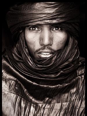
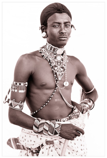
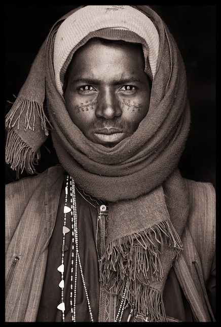
John Kenny
Artist's Statement In my own words
Kenny first fell in love with photography 7 years ago: He was never fortunate enough to receive education from the subject he self taught himself. He knew from the moment he picked up his first Digital SLR camera, Kenny describes the feeling as being able to express himself in such an artistic way is perfect. Kenny is always looking to improve on his skills and broaden his knowledge further: Kenny states that 'he is intrigued by the beautiful: discoveries, experimentation and seeing for the first time how a camera distorts and enhances the world.'
Kenny is particularly influenced by travel: specifically the country Africa. He began in 2006 as there is something that keeps him going back to the country, the urbanisation but in small villages that struggle with there environments: the intricate faces of the villagers that live survive in the most arid, isolated places draws him more and more every time. His goal is to travel to the most poorest stricken places and document their faces with pure natural sunlight against the earth underneath their feet.
He describes the light as unique, the use of flash and studio equipment is not used as their beauty is revealed through this way the best. He almost asks you to guess what the portraits of the people are about and what their ways of life are, this intrigues me the most as I want to create soft light on the faces to draw out their individual features and I want the viewer to know straight away what Im trying to interpret myself through my images.
The following images are taken of Portraits from Africa, an exhibition of photography by John Kenny.
(Kenya Large Format Film(Portraits/ January 2012)
Kenny's photos are so unique as he uses traditional African men and women which are simply beautiful: they're perfectly lit and capture the elegance and pride of the people. Taken from hours of walking, hitching and driving across sub-saharan Africa including some of the most isolated places on earth.
These images were taken with a 10x8 Large Format camera during his second trip to the far North of Kenya. He shot with this camera as it gave him flexibility and an experience to play around with all the different styles you can create.
Edward Weston
Edward Weston
Nahui Olin
1924
Edward Weston
Tina Reciting
1924
I want to recreate emotion through the models facial expressions, I feel Weston has attempted to capture meaning from their poise: The outcome is beautiful, she looks as if she has been surprised by the photo being taken and is embarrassed, as if she is half way through talking. I like the idea of shooting randomly but i feel this is would not fit with my exact line of enquiry.
Portrait of a Woman
Carmel by the Sea, California
Vintage Gelatin Silver Photograph
7 2/8 x 9 6/8 inches
Signed on the mount, stamped verso.
This photograph in particular has inspired me as the angle of her jaw line creates a unique shot, the curvaceous lines that flow throughout her face create an extraordinary sense of shape and poise. In particular the angle and composition of the young lady: Looks quite like the portrait I would like to create in the studio but recreating the school photos that were taken of them several years ago.
I want to go into the studio, with a clear idea of my plans: Weston has influenced me to use the same angle of shot with the model (slight sideways).
Comparing and linking my own work to the work by Edward Weston & Edith Lechtape
From looking at Lechtape and Weston's research I took their ideas and interpreted it into my own. For example from researching Lechtape she contributed to my final layout of prints: copying the two images on top one sheet of a2 paper and creating a border between them. This is to show before and after, old and new I feel having does this presentation format it helps to add interest for the viewer as I have not only looked into the concept but the layout of my images too. Lechtape and Weston are both very skilled artists, they both use black and white tone to add depth and mysterious touch to the portraits. Both photographers use people in their work focusing in on the smaller, more unnoticeable features: for example Lechtape creates surreal and almost abstract shots like Weston he creates shots with an usual view and angle with the model. Both inspired me to put the sitters side ways on to the camera much like old fashioned shots of you when youre younger.
Tina Modotti by Edward Weston
Weston has also used high key lighting in some of his shots: White background which also reflects off the models face as well as being a white back-drop behind the model.
Original Portraits I have chosen to take photographs of my family: in particular my mother:Sharon, older sister:Chloe and younger sister:Maya. To complete the family I took a self portrait of myself whilst in the studio. As one of our finals has got to be in black and white I have chosen to leave my mothers as it is and create a similar sepia tone on the newer portrait: I came into a problem that there are 8 portraits, 2 for every model,I felt it would look unfinished having only one in black and white I changed myself too, therefore creating a stronger set of final prints to show.
First Shoot
The studio plan helped me to be organised and go into there knowing exactly what I needed to do. I truly feel that this is what made my shoot go to plan, therefore I came out happy with each of the and every photo. Some were stronger than there of which I have used for my final prints.
Mother Sharon:
Older Sister Chloe:
Myself:
Younger Sister Maya:
I chose these as my finals as they recreate exactly what the old portraits of the models looked like before. They suggest the strongest view of my first initial ideas: To re-interpret old school portraits of my family from many years ago. I feel i have completed this in a very strong visual way and have taken into account the contextual references I have looked at in specific depth, Especially the work of Edward Weston who has inspired me greatly to play around with the angles like so.


_by_Marcus_Gheeraerts_the_Younger.jpg/170px-Queen_Elizabeth_I_('The_Ditchley_portrait')_by_Marcus_Gheeraerts_the_Younger.jpg)


