Working Title or Theme of Final Major Project: To create floral art pieces to sell.
Project Brief
What I will be
working towards is producing work that I can sell to the public. As I am
particularly specialised in Flower Photography I feel this would create my
strongest set of images. Instead of going for straight photographs of flowers
themselves I tend to focus in on the less obvious shapes, textures and colours.
Therefore the viewer is drawn to look closer as they’re not your typical blooms
and blossoms: They’re something vaguely flowery. I have another idea that will
add another layer to my images; I want them to look fresh and crisp when the
viewer looks at them, choosing flowers that are specifically in season.

Floral Art, Floral Photography, Bouquet by Jetty Koblaric Fine

Art
Photographer- "Indian Summer”
These two Images above by the same floral photographer are my
main influences: Firstly the way Koblaric has taken one flower but then shot it
in four different ways, placing the form in each of the squared format corners.

This has inspired me to use
the same format, layout- Shooting one photograph but splitting it up in
Photoshop into 4 quarters to produce a contemporary layout much like IKEA
produces with 4 shots on different canvases: At the same time I feel drawn
between Contemporary and Vintage effects I will decide when experimenting with
my photographs.

IKEA- Koichi Kajino and Håkan Jansson.
I have looked at IKEA specifically as it is
a company that successfully sells there flower canvases to the public. I am
going
to look into the
work of Karl Blossdenfeldt, Imogen Cunnigham, Edward Weston,
Robert Mapplethorpe and littler photographers that are not famous as such: for
example Andy Small, Heather Edwards and lastly the work by Fleur Olby: I intend
to research in broad depth whether it’s from books or the internet, starting to
present these photographers on my blog.

I went on to research flowers in season: and the one that intrigued me the most was a Dandelion. Below is the research I conjured up:

by Peter Bargh

by Alsion Cattyal
- Daffodils
- Tulips
- Crocuses
- Bluebells
- Narcissi
- ranunculus
- Anenome
- Dandelion Heads: The flower comes out in spring then a few days later the head turns into 'dandelion clocks'.
Exotic Flowers
- Calla
- Bird Of Paradise
- Orchid
- Protea
- Passion Flower
The meaning of flowers:
aspiring
| |
Amaryllis
|
dramatic
|
Anemone
|
fragile
|
Apple Blossom
|
promise
|
contentment
| |
Azalea
|
abundance
|
festivity
| |
Bachelor Button
|
anticipation
|
Begonia
|
deep thoughts
|
Black-Eyed Susan
|
encouragement
|
Camellia
|
graciousness
|
pink
|
gratitude
|
red
|
flashy
|
striped
|
refusal
|
white
|
remembrance
|
yellow
|
cheerful
|
bronze
|
excitement
|
white
|
truth
|
red
|
sharing
|
yellow
|
secret admirer
|
Cosmos
|
peaceful
|
Crocus
|
foresight
|
chivalry
| |
boldness
| |
Daisy
|
innocence
|
spirited
| |
Forget-Me-Not
|
remember me forever
|
Gardenia
|
joy
|
Geranium
|
comfort
|
Ginger
|
proud
|
strength of character
| |
solitude
| |
Hibiscus
|
delicate beauty
|
Holly
|
domestic happiness
|
Hyacinth
|
sincerity
|
perseverance
| |
inspiration
| |
Ivy
|
fidelity
|
Jasmine
|
grace and elegance
|
Larkspur
|
beautiful spirit
|
Lavender
|
distrust
|
Lilac
|
first love
|
Calla
|
regal
|
Casablanca
|
celebration
|
Day
|
enthusiasm
|
Stargazer
|
ambition
|
calming
| |
Magnolia
|
dignity
|
Marigold
|
desire for riches
|
Nasturtium
|
patriotism
|
Orange Blossom
|
fertility
|
delicate beauty
| |
Pansy
|
loving thoughts
|
Passion flower
|
passion
|
Peony
|
healing
|
Poppy
|
consolation
|
Queen Anne's Lace
|
delicate femininity
|
Ranunculus
|
radiant
|
Rhododendron
|
beware
|
pink
|
friendship
|
red
|
passionate love
|
red & white
|
unity
|
white
|
purity
|
yellow
|
zealous
|
presumptuous
| |
Star of Bethlehem
|
hope
|
Stephanotis
|
good luck
|
success
| |
adoration
| |
Sweetpea
|
shyness
|
Tuberose
|
pleasure
|
pink
|
caring
|
purple
|
royalty
|
red
|
declaration of love
|
white
|
forgiveness
|
yellow
|
hopelessly in love
|
Violet
|
faithfulness
|
Wisteria
|
steadfast
|
Yarrow
|
good health
|
Zinnia
|
thoughts of friends
|
Birth Month Flowers
January
| |
February
|
Iris, Violet
|
March
| |
April
|
Daisy, Peonies
|
May
|
Lily, Lily of the Valley
|
June
| |
July
| |
August
|
Dahlia, Gladiolus
|
September
|
Aster, Forget-me-not
|
October
|
Calendula (aka Marigold)
|
November
| |
December
|
Poinsettia, Holly, Narcissus, Paperwhite
|
Sources:
Time Scale
April 16th-30th = Create a spider diagram and plan for my own Project Proposal: Look into the work of photographers that have similar inspiration and ideas. Written my Project Proposal up in neat, Researched further contextual links and talked about them on my blog. Further Research, An in-depth plan of my first studio shoot: Booked for the 2nd May.
May 1st-7th = Taken my first set of images: Edit and write up on blog: The negatives and positives of the shoot.
May 8th-22nd = Continue with further research: Create a plan for my next shoot on the 16th May:Collect the botanical specimens I need for wednesdays shoot, Evaluate.
May 31st = DEADLINE: Have everything to hand in and exhibit my work on 14th of may to the private viewers and the exhibition is open for a week to the public: 10-8'oclock from the 15th of June.
Legal Issues
In my case shooting plants in the studio does not have any legal issues to it: The only problem I feel I am going to come across is the use of copyright. Having my own photographs up in an exhibition means that the public are liable to try and take photographs on their own cameras: Ourselves as invigilators are told to tell all observes that they are not to take photos and if they do you are to intervene.
Even though in my circumstance this does not apply, but for some of the other students exhibiting work with a sense of Sexual Reference, Religion ect... To overcome this there needs to be a written explanation beside the image to put across there view and
intentions of the idea.
Plan of Layout at Exhibition
l18mm MDF stuck onto the back of my photograph
l18mm MDF stuck onto the back of my photograph
- Batons on each panel of MDF
- A1 or A0
- One print split into three panels
- Rectangular shaped depending on the result of my studio shoot
- The bigger the print the more impact it will cause to the viewer
A1 841 x 594 mm 33.1 x 23.4 in

21cm x 57.4cm 40cm x 57.4cm 21cm x 57.4cm

Initial Research
Triptych
Triptych
I came up with the idea of presenting my final prints in a split canvas layout(triptych) as I feel the presentation is as important as the actual image itself. I feel it adds to the linear qualities that are founded when I have used a macro lens, to reveal the unknown.
I also chose this way of presenting as I feel it splits up the image to make a stronger set of images: So when the viewer at the exhibition observes, it will not look so overpowering.


Low key Photographs
Christopher Beane
Beane became obsessed at an early age by the forms of botanical subjects. I felt I would look closer in depth into his photography as he simply transforms pictures into unique and dramatic works of art for the public to see. He is particularly inspired by the works of Robert Mapplethorpe & Georgia O'Keefe: In some ways he is similar to these artists as they captured the ambience of flowers and colour but Beane seems to capture unusual shapes and textures, which aren't usually seen at first glance of a flower.
Beane left the black & white world of photography behind in the 1990's and went head-first into photographing in colour. In the words of Anthony Janson of whom narrates his books he quotes:"Beane is mainly interested in the use of a macro, Beane is always exploring new techniques and ways of deconstructing flowers to see a new appearance."
Ranunculus


High Key Images Sourced From Google

Above: Low key with extraordinary exquisite detail against the crisp black background: A spiked dahlia flower. I personally think this has been highly edited in photoshop or some other editing software, I presume the contrast in colours has been strengthens to make the colours stand out stronger from the background. this particular image from google images has inspired me to shoot in high key in the cocoon, but then edit this to low key strong black background.


I chose this photo because of the lighting. Purely because it makes the Lotus flower look so beautifully composed, the soft lighting is highlighted on the individually poised petals falling gently over each other.


Macro Flower Photography

Floral Serenity |
A daisy next to the flower is caught in the water droplet that is resting on the flower's stamen. This photo has a narrow depth of field to ensure the water droplet has a sharp focus on the stamen, whilst the background is out of focus.

Deep Purple |
This macro photograph shows a very deep purple coloured flower with plenty of detail on the pollen tipped stamens. The petals blend in and out of focus in an abstract way because of the short focus of the lens used.

Whisper White |
This stunning piece I found appears to have a water droplet resting up on the small shoots. I feel you wouldn't know what the flower actually was as it is so abstract and close-up. The white petals flow out of focus from the centre creating a wispy dreamy like feature.
(Ron Van Dongen)
Colour
Dongen was born in Venezuela in 1961. He grows his own photographic subjects in his own back-garden, he then captures their beauty using a large format view camera. He was a very accomplished black and white photographer at first but then he went he started shooting in colour.
Dongen was born in Venezuela in 1961. He grows his own photographic subjects in his own back-garden, he then captures their beauty using a large format view camera. He was a very accomplished black and white photographer at first but then he went he started shooting in colour.


"Yes, basically going from black and white to color — I don’t know what the analogy would be — I find myself standing in a candy store! "
Experimentation By Ron Van Dongen with Black and White


Stewart McCarthy
Creating zoom blur flower heads in photoshop:
This has inspired me to create the same effect therefore for the viewer it suggests a dreamy and surreal outcome, but i am going to try and create this effect by using a narrow depth of field: a different approach on just a straight portrait of a flower.


Robert Mapplethorpe
Flower Series

Two bodies intertwined round each other suggesting a sexual position, curvaceous lines to represent the body

Calla lily, 1984
Curvaceous lines and textures to signify the shapes of the body, and the shapes of the sexual organs for example this flower in particular suggests a woman genital parts and similar to the orchids below:

Orchid, 1989

Poppy, 1988
This is a photograph of two poppies: One suggests a smaller form which could signify a baby and the other an older figure such as a parent. They're bound round each other this could signify a tight and strong relationship with one an other.
The language of Flowers'(Novel By Vanessa Diffenbaugh)

Vanessa's book "The Language of Flowers" is a story of a girl called Victoria, she is a young woman from the foster-care system who uses the Victorian language of flowers to communicate with others and help her deal with her troubled past.
Vanessa quotes "My goal was to create a usable, relevant dictionary for modern readers, I deleted plants from the Victorian dictionaries that are no longer common, and added flowers that were rarely used in the 1800s but are more popular today." The feeling I get from Vanessa's book after skim reading sections, is mesmerising: She seems to move the reader with her elegant and almost trancing words. It weaves between the past and present which keeps the reader very intrigued. Vanessa never seems to leave anything out every detail is written, you can picture a vivid portrait in your mind of a young woman who's gift is to express her feelings from her troubled past through the use of flowers.

The Victorian language of flowers was used to convey romantic expressions: honeysuckle for devotion, aster(a plant of the daisy family that has bright rayed flowers, typically of purple or pink) for patience, and red roses for love. But for Victoria Jones the character in the book, it’s been more useful in communicating grief, mistrust, and solitude.

Which lily has the strongest scent-(Stargazer Lily)
The flower dictionary by Vanessa is very interesting, you can find out what flower signifies each emotion: (http://aboutflowers.com/images/stories/Florist/languageofflowers-flowerdictionary.pdf
Van Gogh
Vincent was a Dutch post-Impressionist born in 1853 and later died in 1890 from a gun, although no gun was ever found where his body was. He died at the age of 37, his life had its ups and downs mainly because he had anxiety and mental illness issues.
Gogh inspired many people in the 20th century with his beautiful paintings as they were known for there rough beauty created by erratic strokes of bold colour. In just over a decade Vincent produced more than 2100 pieces: which included 860 oil paintings and 1300 watercolors, drawings, sketches and prints. These included pictures of people, landscapes, flowers: specifically sunflowers which were produced in the late 1880's. His sunflower paintings are some of his most famous of which he painted in France, instead of the classic sunflower seen today Gogh painted a different sort which look like fuzzy pom-poms attached to the stem. They are my particular favourites as they show the diverse pictures you can create when focusing in on bold and outstanding colours. this could be associated with the emotions you deal with through your life for example yellow for happiness and jealousy to the brown, wilting tones he uses in his work that could mean death.

Flowers in a Copper Vase 1887

Vase with Twelve Sunflowers


Irises

"Still Life: Japanese Vase with Roses and Anenomes"
painted at Auvers, now in the Musee d'Orsay in Paris.
Fleur Olby
Olby hopes to follow in the footsteps of photographers such as Karl Blossenfeldt and Anna Atkins. Her work is very inspiring especially myself as she follows on this tradition of
carried through the centuries: from the earliest of cave painters to contemporary photographers today.
Penstemon Pink Panther 1
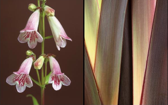 Olby explores the use of colour. Especially through through the use of isolation, each plant is highlighted by a different colour in the background (almost clashing colours) And somehow has the skill to create photos that have extraordinary detail and makes them glow with translucency.
Poppy Rose Thorns


Ori Gersht
Exploding Flowers & Other Matters
Ori Gersht was born in 1967 and is a israeli fine art photographer, who now lives and works in London. Gersht involves many subjects in his work. With themes involving life, death, violence, and beauty.

Ori Gersht ‘Pomegranate’ 2006.
Gersht challenges the relationship between photography, technology and optical perception. He is interested in putting all these aspects into his images, by shooting still but at the same time film(moving:) by exploding the actual real still life's. He is been inspired by Cotan and Edgerton's fast photography- I can see how he has been influenced as he has taken each aspect of there work and incorporated into his own personal idea. In particular I love the pomegranate image, the pace of the bullet flying straight through the fruit produces an explosion of pure red seeds, it's as if Gersht has stopped it in slow motion before capturing it. Much like Cotan's paintings but with a different atmosphere as once they were balletically composed and now Gersht has transformed it into an almost fight with blood spraying everywhere to suggest a challenge between war and peace.
This photograph is based on Sanchez Cotan's paintings (June 25, 1560 – September 8, 1627 died at the age of 67): Cotan was a famous spanish painter that abandoned the typical subjects in 1603, packed up his workshop and moved to a peaceful Monastery away from the busy, greedy consequences that painters were using as there subjects. The painting below Quince, Cabbage, Melon and cucumber was crated in 1602: it is one of the most beautifulest painting I have ever seen. This is part of his notable still-lifes from around the turn of the seventeenth century.

His fruits and vegetable still life paintings are arranged in a beautiful, ballet like manner. Although he is vegetarian, many of his pieces have game birds in: probably because of their extraordinary rainbow like colours seen below.

Film of Ori's work:
(http://www.exitmedia.net/prueba/eng/articulo.php?id=228)

"In Time after Time I explore relationships between painting and photography, past and present, revisiting fundamental philosophical conundrums concerning optical perception, conception of time and the relationships between two-dimensional representation and objective reality. These photographs resemble 17th century Dutch still-life flower paintings. However, unlike the originals, these capture the flowers at the moment of explosion at a transitory fraction. Clearly, such violently frozen spectacles were inconceivable during the Renaissance and Enlightenment and only became visible due to the invention of high speed photography and other related advanced technologies. In his seminal essay A Short History of Photography, Walter Benjamin elaborated on the potential of photography to enhance and expand the visual perception of reality."-Ori Gersht
| ||
| ||
 Capturing each shattering still-life at a speed of 1/3200 Capturing each shattering still-life at a speed of 1/3200
Ori Gersht. Untitled 9 1/6, 2006.
|

Revised Project Brief
| Scientific Name: Taraxacum officinale Common Name: common dandelion |
Weed: A plant considered undesirable, unattractive, or troublesome, especially one growing where it is not wanted, as in a garden.
Your first reaction after seeing a weed.. That is ugly, a nuisance or maybe even ignored completely? Through my photographs, I have challenged these views by attempting to show the undeniable beauty, I believe they truly behold.
Following on from my project brief I feel that looking specifically into the nature and what is plants are classed as weeds seems like a stronger idea. Now my working title will be to sell pretty images of 'weeds' that are usually seen as horrible to people. I want to challenge the stereotype of weeds being disgusting and boring: So for my next shoot in the studio I will photograph several subjects with a macro such as Nettle, Ivy, Bind weed, Wild/common poppies (poisonous to livestock & over grows in arable land), Thistle and bramble. Below I have looked into english weeds that have been photographed by people before, It is extraordinary how the colours are so strong and the textures stand out against the background so strong: People at first glance would not see these as weeds like they do in their gardens;
Common Poppy
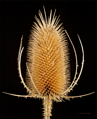
Common Dried Teasel Head
Shoot One
I planned to do a test shoot, and this is the outcome. I collected plants (weeds) that particularly interested me, and then played around with different lightings. This shoot helped me to plan a second shoot of which I will be shooting with a Dandelion: Because I feel it has created the strongest image when observing the contact sheet, the soft spidery seeds create a soft atmosphere for the viewer.


Prints


F11-1/125

F11

F11

F11
Editing

Sharpening tool to make the outline of the petals more present.


Sharpening and adjusting the contrast as I want to create a powerful tonal range, Also the spikes become highlighted by the pure black background: On photoshop I added in a fill light from the front just to give an extra glow to the teasels texture and shape.
Experimenting with Solarizing


F11-1/125-100MM
Cowslip: I began by adjusting the exposure as it was quite over-exposed, this made the shape stand out stronger against the background, I love how the foreground is filled with small yellow screwed up flowers: The depth of field is interesting as each bud seems to feel as its reaching out towards you.

I particularly like the way the spider web is highlighted in the original photograph, although there is not much detail in the flower as the image is over exposed: bleaching out the shadows and highlights. Below I have tried to overcome this and adjust the exposure, the final outcome has added interest in the texture and colour to create a golden effect to the wilting petals.

Purple Thistle

F10-1/125-Focal Length 100

With this photograph I desaturated the colour to create a gloomy effect, I feel it doesn't work very well as the individual petals blur into one.

F10-1/125-Focal Length 100
Plan For Second Shoot
- Cocoon
- Honeycomb
- One light and stand
- Black velvet on the table underneath the dandelion
- Fresnel from behind
- Several flowers in season as well as exotic and wild plants that would give unique and different shapes/texture e.g spiked,curved.
- Black material underneath
- Carrier to hold the plants especially the dandelion as it will easily be damaged and the smaller petals will fall off: to resolve this problem I will borrow a small case to stand each individual flower that I feel could be damaged on the way into the studio.
- Fresh flowers from a florist and or in and around the city: A difficulty I feel may happen is the forms wilting or dying as they are being picked, To overcome this I will book the studio for the afternoon. Therefore I can get the flowers in the morning fresh enough for the afternoon.
I hope my shoot to turn out similar to the image below by Andy Small:


Health & Safety in the Studio
When working in the studio I need to take into account the health and safety precautions that need to be in place:
When working in the studio I need to take into account the health and safety precautions that need to be in place:
- Make sure the cap on the mono-head is taken off before turning the light on, otherwise it would melt onto the bulb and flash tube.
- Be careful you don't break the equipment as its very expensive/costly and dangerous to the people involved.
- Do not handle the equipment when on if you have wet hands: reduce by not touching the equipment when wet
- Tape cables and loose equipment to the floor to avoid tripping over
- Have clear instructions and rules around the room on posters
- Make sure there is sufficient space for everyone to move around without a tripping/collision hazard.
- Light: Flashlight is very strong and can damage the eyes.
- Never lay cables or anything else over hot lamps allow them to cool first.
- Being in the dark is a hazard, turn on the light when necessary otherwise an injury will occur.
Studio Plan
Cocoon:This modern and handy enclosed cocoon shaped object helps if you are shooting with still lives, as I am I feel this will help to create an easy shoot.
I will place a light on a stand either behind or to the side, the effect the cocoon will have on the flower is a natural, soft glow and an even light all over the form.

Honeycomb:If I were to not use the cocoon I may experiment with the Honeycomb tool. This will create an even effect of light over the subject and soft, the comb also puts all the light into a narrow stream aimed straight at the natural form.

Canon Macro Lens 100mm

Fresnel:The fresnel lens produces a classic Hollywood-style of lighting. Highlighting the shapes and outlines of the dandelion clock seeds perfectly.

Shoot Two
Page 1
This shoot went extremely well, I felt the white on white worked particularly best as the dandelion seeds merged into the background: creating a dreamy effect for the viewer. I went into the shoot knowing I wanted to create a certain image: A scenario: A person is all stressed out and walks in to their front room, they see the wispy, relaxing image on their wall it calms them down.
The white on white is effect as when presented and mounted on a colourful wall the dandelion stands out from the wall. Although if its a white wall presented on, the 18mm MDF card and mirror plates create a 3D effect, that makes it stand away from the wall.
The white on white is effect as when presented and mounted on a colourful wall the dandelion stands out from the wall. Although if its a white wall presented on, the 18mm MDF card and mirror plates create a 3D effect, that makes it stand away from the wall.


Page 2

Page 3

Prints

1/125sec-f2.8-100mm-No Flash
Before

After

1/125sec-F2.8-100mm
Before


After
1/125sec-F2.8-100mm

1/125sec-F2.8-100mm
This is not my strongest image as the cream seed heads do not fit, and also clash with the tone of the plain white background. Also the image has been cropped, this of which makes the frame too full, with out of focus linear qualities coming from many directions.
This is not my strongest image as the cream seed heads do not fit, and also clash with the tone of the plain white background. Also the image has been cropped, this of which makes the frame too full, with out of focus linear qualities coming from many directions.
Before


1/125sec-F15-100mm-No Flash
Long panel- I began editing the photograph above and thought that it would look particularly stronger if I re-seized the images so that it was a rectangular shape. I feel this would create a bigger impact on the viewers in the exhibition, as it creates more depth to the dandelion head: reaching in further with your eyes to see more details revealed.

Canvas texture


Development of my idea:
Technical Ability:
Technical Ability:
One white (cocoon & high key)& One black background (Low key)-
I shot these two images in the studio: The high key image was taken inside a cocoon with one light directly behind the subject, White on white with an F stop of 2.8. Whereas the other image with a low key background was taken on black velvet, with one direct light behind the dandelion to highlight the seeds. I personally prefer the white on white with a high key background as I like that it goes against 'photographic rules' and that the shape of the dandelion itself fades into the background.


Wide (Everything in focus) & Narrow Depth of Field- I want to compare the depth of field I have used the first image is taken with F15 which forms a wider depth, I wanted to experiment with everythign in focus, after doing so and looking at the result I felt it wasnt the image I wanted. Therefore I went back and shot in a cocoon with F2.8 to create a narrow depth, this created the perfect image I had in my head as it made a softer effect and some in focus.


Final Image- I used an aperture of F2.8(narrow DOF) as I like the effect it creates, which is a dreamy and softer glow than a wider depth of field would have produced. Also I chose to use a white background because if it was black it would create a very harsh appearance.

Final Image
Before


After
1/125sec-F2.8-100mm

This shoot was my strongest out of the two, as I feel the Dandelion gave the photo I had pictured beforehand. The photo above is the strongest: I particularly like the dreamy effect, the spidery and feathery textured seeds that turn blurred as they reach the edge of the image. I have edited the photograph again and created, what I think is my Final Major Project Piece. I could not use the photograph above as I had accidentally saved it as a JPEG, when transferring over to the mac from the 5D. Below is my final photograph:

Evaluation
After looking at my final image and presentation of three panels with my tutor (Andrew). Below is the notes that he wrote for me to improve and produce a stronger project if I could of planned better and had more time:

A strong project so far but could be improved by reaching out and creating another meaning, to further the concept of a dandelion clock: photograph it in the studio with the seeds being dispersed: to show the growth and then the death of the plant, This would start to suggest how time is such an important aspect of photography and it would also tie in with the idea of the Dandelion Clock-using it to tell the time.

As I want to achieve the highest possible grade I would like to take on these criticisms and approach them in a professional manner. I am going to re-create the same lighting and backdrop as my final image at the moment, Also I want to play around with a different layout so showing the series of life to death through time- the first a fully grown and blossomed head, the second a half blown head, the third just the stalk with the holding pod and lastly the stalk alone bent and dead. The photo below does not use much technical ability but it suggests the concept I have explained above: Following on from this I felt I did not have enough time to re-shoot, and that I was happy with my final. If i were to go back and do this project again I would have a created a more thorough time scale, Also I would take many more shoots, therefore experimenting with more techniques and showing my technical ability further.

1) Also he suggested to look into the work of Ori Gersht.